Friday, February 20, 2009

Pencils Down

A pop quiz?! My good friend, Sara, the queen of awesome information, posted a link to this quiz from Sproost and I couldn't help but take it. What can I say, I'm a sucker for self-exploration quizzes!

Sproost is a really cool site, they help you discover (or focus) your personal style to make your home a place you love. I really enjoyed the descriptions of the different styles, they seem to be dead on what I'm into. I try to suppress my love for the beach, just isn't right in the dead of winter in Indiana...

Here are my results: (I've added a quick shot from around the house that I think represents each style.)

Cottage Chic (50%)

Who says that cottages can't be modern and chic? Who says that they have to be floral and cheesy? Not you!

You love the carefree spirit that the cottage interior inspires, but you are also serious about your appreciation for modern art and hip treasures. You love old and new alike, and love to highlight them all to expose the uniqueness of each. What better way to show off these treasures than with a light background?
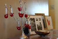


Nantucket Style (30%)

Oh how you love the beach! Who doesn't, right? And so your dream home is either perched in your favorite beach town, or you've brought that favorite beach town into your house.

Your art and accessories speak directly to the activities that are found at the beach. Pieces of driftwood you found here, pictures or paintings of the amazing views there. Things that remind you of the coast - surf boards or fishing boats - are found throughout the house. The feeling of the seaside is both abstract and literal in the design of your space. The fabrics are natural, cottons and linens and are light in color and touch. Much of the furniture is wood or wood framed (the lighter the better, think driftwood!) and wicker, when done right, is a must.

And since your true inspiration is the sea, the colors and textures in your home are the same that you would find at your favorite beach: white, light beiges and grays of the sand and driftwood, a variety of blues for the ocean and sky, and greens and vibrant blues of the sea glass, but the key is white! Your space should feel light and airy and give off the mood one has when at the beach: laid back!

Your furniture is comfortable and the layout is cozy. The more it reminds you of actually sitting on the warm sand, the better! And what do you do at the beach? Hang out with family and friends - and your home is just an extension of this play place. And though the space is filled with large white furniture, it somehow manages to feel both durable and casual.
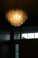


Vintage Modern (20%)

Flea Market, anyone? You know you are drawn to modern furniture and interiors, and yet you don't like a space that feels cold and sterile. And who could blame you? That's why Vintage Modern is so appealing to you. Though the backdrop of the room, the walls and windows, are many times white or monochromatic, the furniture and accessories have the color, shape and texture to bring the warmth into the space.

The great thing about Vintage Modern is ease of mixing different styles in the one space. You can have a new modular sofa mixed with a great pair of chairs that your grandmother purchased in the late 1950's. The new and old work appear as though they were destined for each other. Even if you don't have time for swap meets and garage sales, so many of the mid-century pieces were so great that they have been remade and mimicked year after year.


Monday, February 9, 2009

Photoshop Elements for Dummies like me

Inspired by the always thought provoking and informational Digital Photography School post on Processing Black and Whites, I decided to give to warm up some black and white photos myself with Photoshop Elements.  

So, if you're an Elements user, here is a quick and dirty tutorial on making warmer black and white photographs.

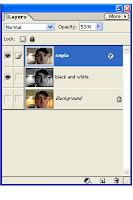
1. Start by making 2 duplicates of the Background Layer, for the sake of this tutorial, we'll call these new layers B&W and Sepia. To duplicate a layer, click on the more button in the layers tab and you'll find "Duplicate Layer".

2. Make sure the Sepia layer is at the top of your layer box and the B&W layer is just below it. Simply click and drag to change the order of your layers. Whichever layer is closest to the top will be shown first.

3. Select the Sepia layer, and then click the Layer Styles tab. Use the pulldown menu to select Photographic Effects and the select the effect "sepia". Before finishing up with Sepia layer adjust the Opacity to between 50-60%. This can be adjusted layer for the desired effect. 

4. Select the B&W layer, and from the Enhance menu select Adjust Color and then Remove Color. Now you have a black and white image. While under Enhance you may want to move the contrast to the right a bit. 

5. Now your photo should that warm feel that's not as stark as black and white but not sepia either. You can easily adjust the opacity of the sepia layer to play with this effect. 

Here is the Sepia layer:
Here is the black and white:

Here is the finished product:


And here is the same image but I left the color in the eyes by making another layer: 


Okay, now rock out the Elements! 

Sunday, February 8, 2009

Sewing Bag Zen Moment - #23

Ever had a project that you started, but never finished, and then it loomed over your head for what seems to be FOREVER??  My project is #23 on my list of 28 for 28 and here's the story:

About 4 eons ago, my creative buddy, Amy, and I started these sewing bags. Like most projects, these bags started as a quick project to carrying our sewing stuff between homes. Of course, after some major brainstorming we came up with this not-so-simple sketch with piping and the works.


Fast forward to today, I finally finished the bag! It did turn out large enough to put my whole sewing machine in (if I ever want to take it one the road I'll be good to go), but it will also be great to carry fabric and all my little sewing tools. Mostly I'm just blissfully happy to have it DONE.


Check out these other list items:

#19 (January) - Vistit a new place at least once a month
#11 (January) - Take (at least one) portrait a month


Monday, February 2, 2009

Foto Friday - Gone in a flash


January's Foto Friday is all about Flash. FF Co-creator, Jen, wrote a great post on the Flash Compensation settings on her Nikon.  To my slight dismay, my Canon does not have a flash compensation. 

But with the help of Photojojo, I made this handy little diffuser from an old film container. This creation is a quick, low-tech way to tame that flash!


The one and only step:
Remove an area the same width of the flash with an exacto knife.


The diffused difference:

Without the diffuser - Too stark

With Diffuser - Must softer

Photographer Beware: You may want to close your eyes just before you snap the shot. The diffuser, if not tight enough, can reflect the light back toward you a bit. Consider yourself warned!

Sunday, February 1, 2009

Photo Weekend - A Series of Shots

Sue threw out a photo weekend challenge inspired by these sledding shots Scott and I took earlier in the week. The challenge is to create a series of shots telling a story. 

Well, here is the story of the intensity, luck, and heartbreak known as the Farming Game. Special thanks for the brown farmer, Sara, for allowing me capture a roll of fate. 


(click on the pic to see it larger)

To change it up a bit, I tried to get an retro feel by tweaking the color as well as adding some grain and blur. I adjusted the saturation down, contrast up and pushed the hue toward yellow.

Here is the pre-tweaked original for comparison.